A visual system built for clarity and controlled application.
Logo, colour, typography, imagery and application guidance drawn from the current 2026 Visual Brand Standards. Messaging approval remains a separate lane.
Current sourceVisual Brand Standards · 2026
Visual direction
Make complex work feel structured, connected and human.
The system reflects the operating reality of project-based professional services firms while keeping people and meaningful work in view.
01Project-aware
Show structure, coordination and the realities of work organized around projects.
02Connected
Use composition and visual relationships to connect operations, systems, data and people.
03Clear
Create confident hierarchy, generous spacing and an obvious path through information.
04Human
Keep professionals, collaboration and meaningful work visible in the brand.
Ordinary use on light surfaces, including document covers and presentation openings.
Reversed
Use the supplied white artwork on navy or a sufficiently dark, quiet background.
Single colour
Reserved for small or single-colour applications. Use the full-colour variant for ordinary collateral.
One mark per surface
Use the full logo when the brand is being introduced. Use the brandmark only where the full logo cannot read at size or the brand is already established.
Maintain clear space equal to the height of the 45 numeral.
Do not stretch, rotate, recolour or add effects.
Use supplied files rather than recreating the mark.
Clear space measured from the supplied logo artwork.
Colour
Core structure first. Accent with restraint.
70% core · 20% accent · 10% support
Navy#000C40Core
Cobalt Blue#00B7FFAccent
Cyan#0CC0DFSupport
Alice Blue#F0F8FFBackground
Steel Grey#5B6675Body copy
Cobalt Purple#35328BSupporting accent
Rhodium Silver#A8B0BCSupport
Light Grey#E6EAF0Structure
AA
Small text requires a contrast-safe colour.
Use #004AAD for cobalt-coloured labels, links and small type on white or light backgrounds. Bright Cobalt Blue remains an accent and large-display colour.
Navy / White18.6:1Approved
White / Navy18.6:1Approved
Alice / Navy17.4:1Approved
Cobalt / Navy8.2:1Approved
Purple / White10.6:1Approved
Navy / Cyan8.5:1Approved
Typography
Clear hierarchy. Controlled emphasis.
Aa
IBM Plex SansPrimary typeface for headings, titles and key statements
Aa
InterNavigation, labels, metadata and concise interface copy
Aa
Source Sans 3Approved social and digital templates only
Design elements
Structure without visual clutter.
45RhRHODIUM
Use the element frame as a structural cue. Keep gradients to one accent treatment per layout, use restrained dividers and never stack competing framing devices.
Methodology marks
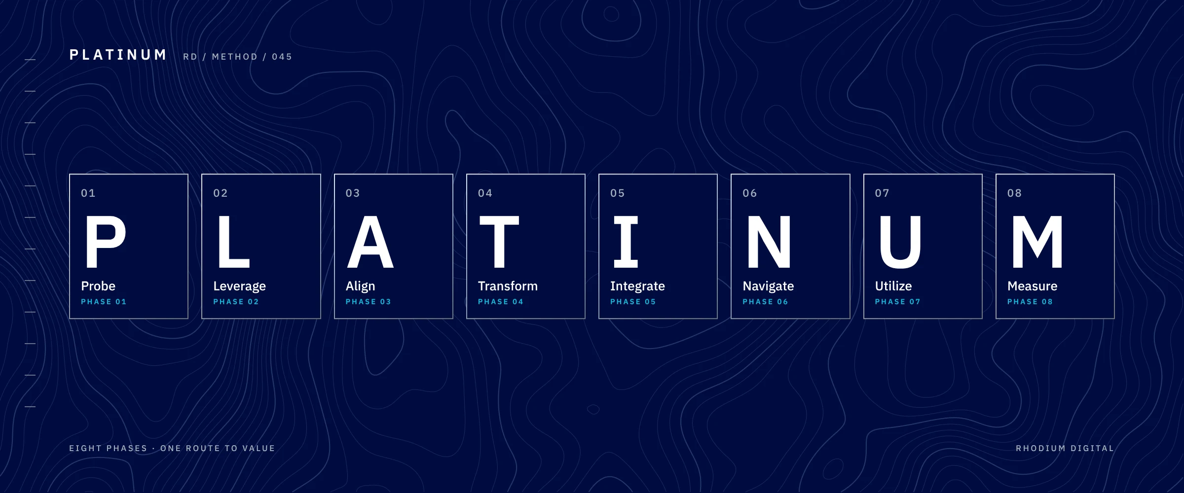
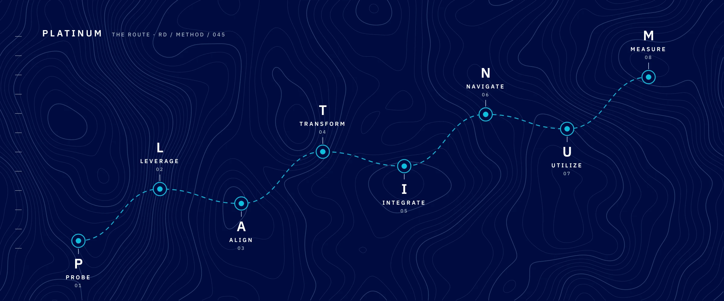
PLATINUM. Eight phases, one route.
PLATINUM is Rhodium Digital's delivery methodology. Each letter is a phase, shown as an element tile in the same family as our Rh mark.
P · Probe
L · Leverage
A · Align
T · Transform
I · Integrate
N · Navigate
U · Utilize
M · Measure
P stands for Probe. Never Plan.
Keep the phases in order. Don't drop, merge or rename them.
Use the supplied artwork. Don't retype the letters or redraw the tiles.
Use the navy set on dark surfaces and the light set on light surfaces.
In proposals
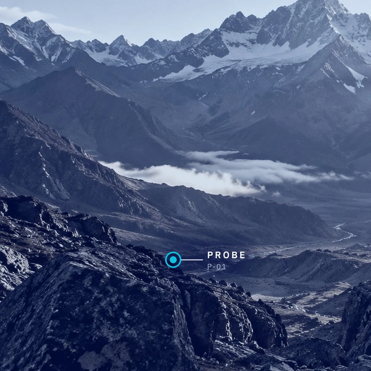
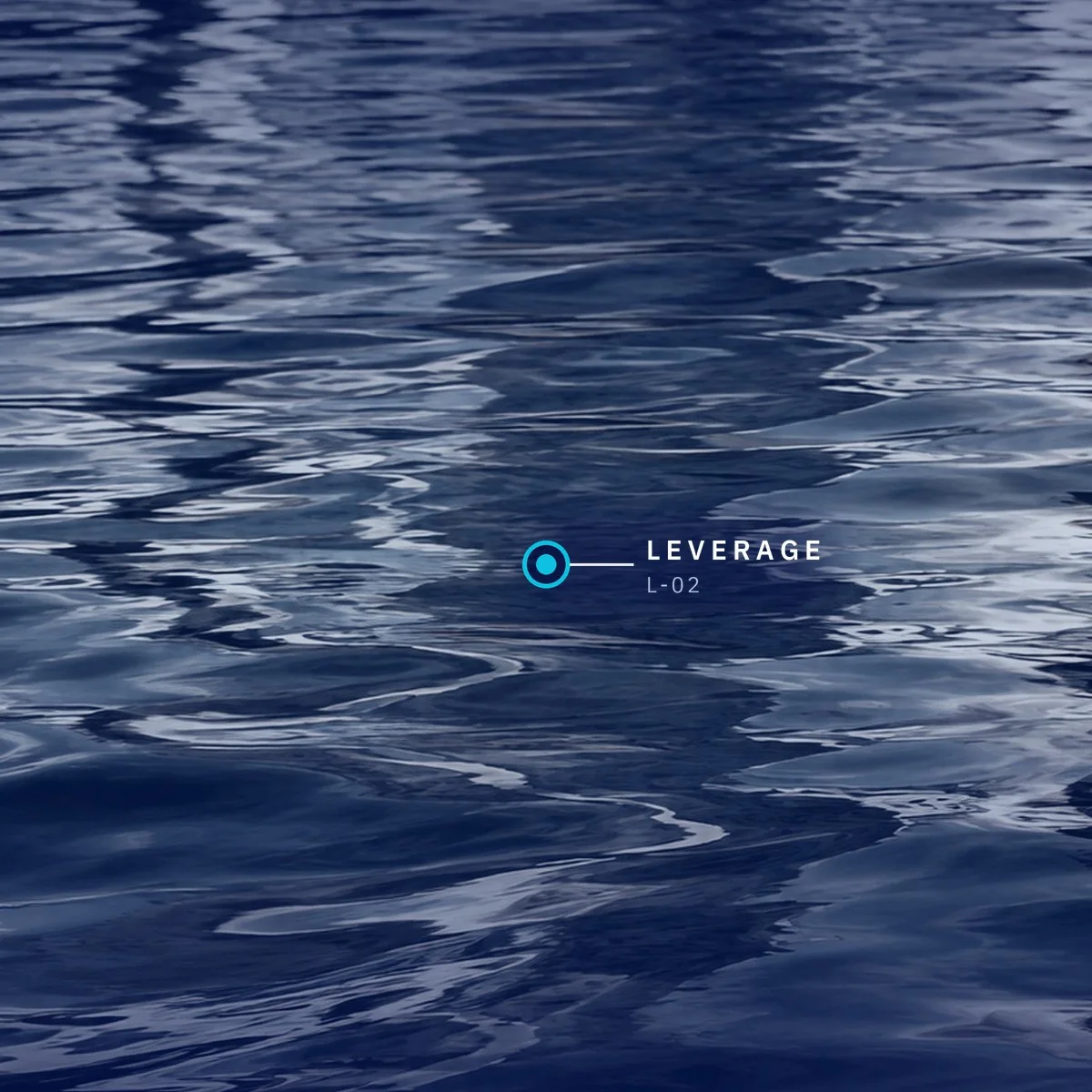
Each phase can carry its own photograph and checkpoint.
 Full colour
 Reversed
 Single colour